Genuary, a challenge that provides a month of generative art prompts during January, came and went this year without me knowing anything about it. Even though I missed Genuary proper, I decided to take on some of the prompts after the fact. I wrote all the prompts on pieces of paper, put them in a bowl, and chose one at random. The first one that I chose was Day 21: Persian Rug.
I had a visual reference in my head for what a Persian rug looks like, but I still read up on them because the Genuary page very kindly provided a link to the Wikipedia page for Persian rug. I took two major things away from this:
The rug tends to have two perpendicular lines of symmetry; each of the four quadrants is the same pattern reflected over the two center lines of the rug.
The Persian Flaw: a deliberate mistake included in the rug’s design. Weavers would sometimes leave imperfections in the rug because they believed that only God can make perfect creations so the rug needed to be deliberately imperfect.
I covered the first point by using Conway’s Game of Life, since the patterns that show up in Life remind me of patterns in Persian rugs. I created an array that started with a random arrangement of cells, mirrored it twice to get the necessary symmetry, and then used the rules of Life to propagate the system a few iterations until it looked rug-like to me. Here’s a gif of what that looks like:
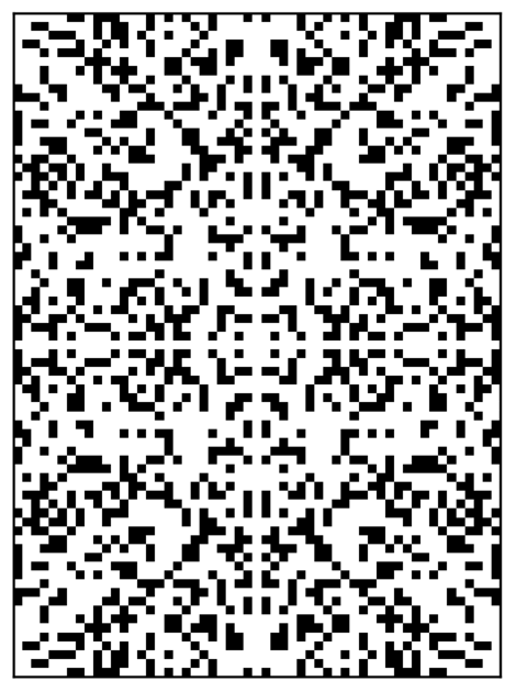
The black cells represent cells that are ‘alive’, and the white cells represent cells that are ‘dead’. A cell dies if it has too few or too many neighbors, but survives if it has just the right number of neighbors (three).
However, this version doesn’t have a Persian Flaw. To add one, I made the rules of Life probabilistic. For every iteration of Life, there is a small but non-zero chance that a cell will die randomly. Because the entire rug is running the rules of Life at one, a random cell death introduces a small asymmetry in the rug’s pattern. Here’s a gif of a rug run with probabilistic rules of Life:

This is propagated with the same rules as the previous gif, but in this one the red cells indicate where a cell has died randomly. Note that these random deaths do not occur along the rug’s lines of symmetry.
I chose three of these slightly-less-than-symmetrical rugs, each started from a different random arrangement of alive/dead cells, and decided to layer them to give some complexity to my final SVG that I would send to my plotter. For each alive cell, I plotted a circle, and I made the radius of these circles different for each of the three rug layers. Here are the three component rugs that I used to make my final rug:

And here is these three rugs stacked up and color-coded with the rug-esque colors that I had chosen to plot with:
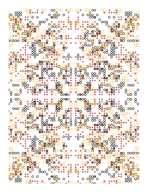
Can you find any of the minor asymmetries?
Next, it was finally time to move to the plotter! I chose to plot on kraft-colored paper, since I felt like that matches the Persian rug aesthetic better than white paper.
I needed to make sure that each of the three layers were registered to each other correctly, because any misalignment became very apparent in places where three circles were plotted on top of each other.
Behold, the final product!

Very successful and very fun first Genuary project, keep on the lookout for more of them! We’ll see if I actually finish all 31 before next January…
